
Top 5 Power BI features of 2025
At Seven Red Lines, Power BI is at the core of how we design, scale, and govern analytics solutions for our clients. It is the platform we work with daily through executive dashboards, enterprise semantic models, and large-scale BI deployments.
The end of the year is a good moment to pause and reflect. Not on hype or previews, but on what is actually delivered, officially released, and ready for enterprise use.
2025 has been a particularly strong year for Power BI. The platform matured in ways that meaningfully impact productivity, governance and the quality of analytical storytelling, features that solve real problems teams face every day.
With that in mind, here is our perspective on the Top 5 Power BI features of 2025. Practical, production-ready, and already shaping how we build modern BI solutions while still giving us plenty of reasons to be genuinely excited about what’s next.
Top 5 Power BI features of 2025
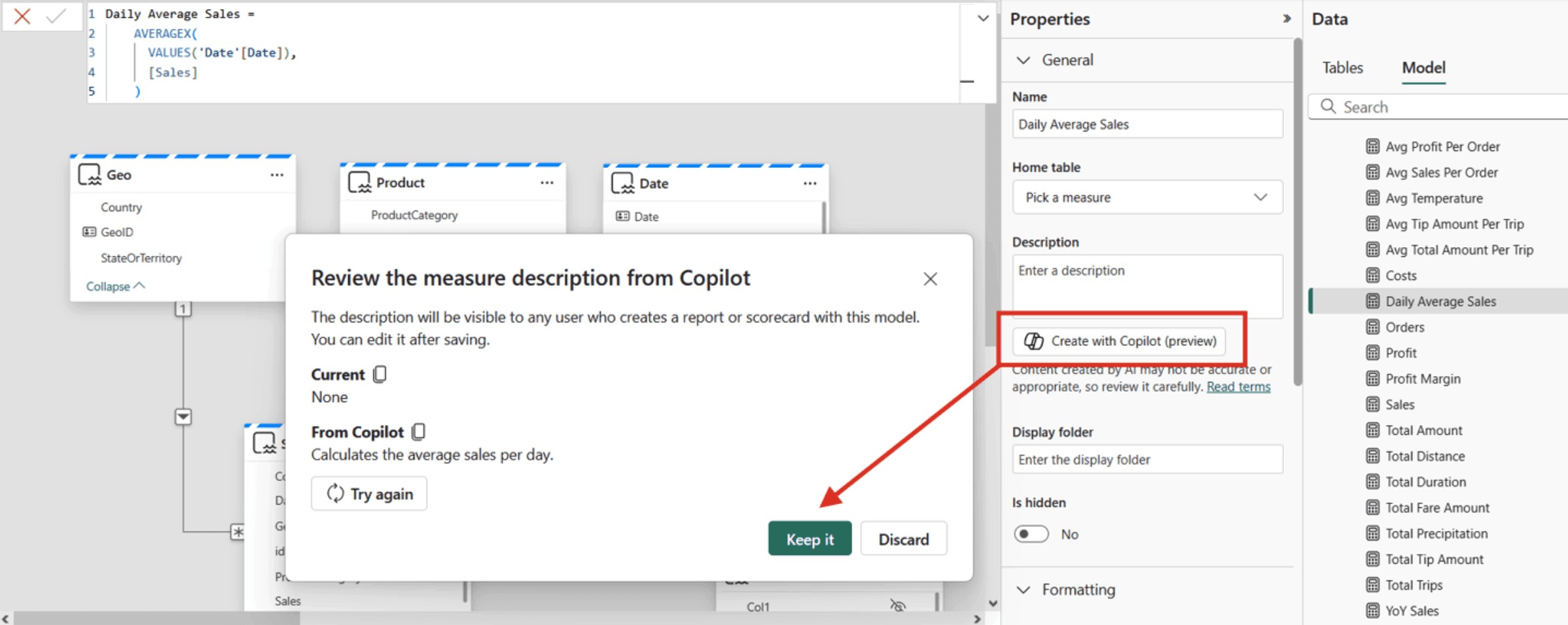
Power BI Copilot for Measure Descriptions: Now generally available, Fabric Copilot can auto-generate measure descriptions in your semantic model. With one click in the modeling view, it writes human-readable descriptions from DAX formulas (e.g. ‘Total sales YTD’), ensuring consistent metadata. This AI-driven automation saves analysts time and helps report authors understand metrics at a glance.
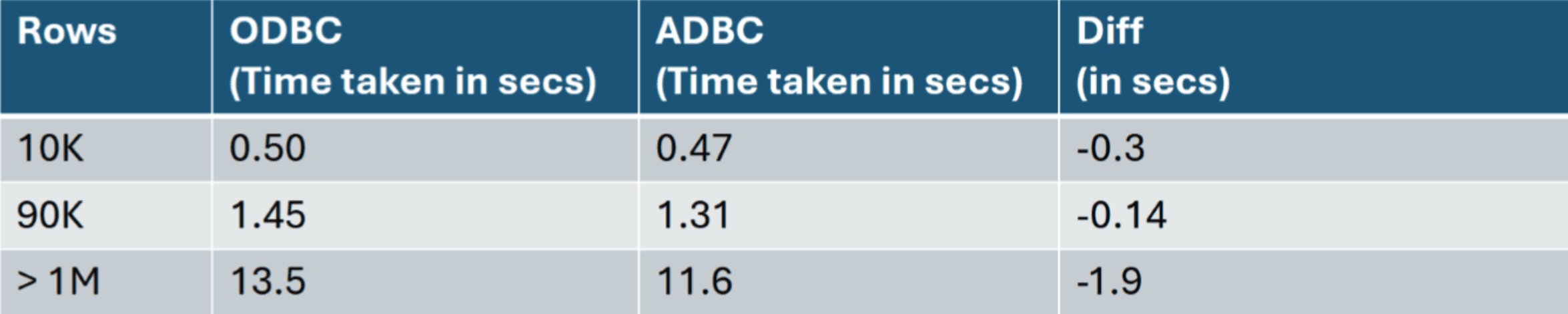
Next-Gen Data Connectors (Snowflake, Spark, Impala): Arrow-based 2.0 connectors for Snowflake and Spark/Impala bring major performance gains. By using Microsoft’s open-source ADBC driver, these connectors fetch large datasets with minimal overhead and improved security. For enterprises on Fabric or data lakes, this means much faster query times and more stable, scalable data access than legacy drivers. Below is a relevant experiment, when comparing the ODBC implementation (1.0) to the new ADBC implementation (2.0) using the NYC Taxi Green Dataset, the load time improvements were measured as:
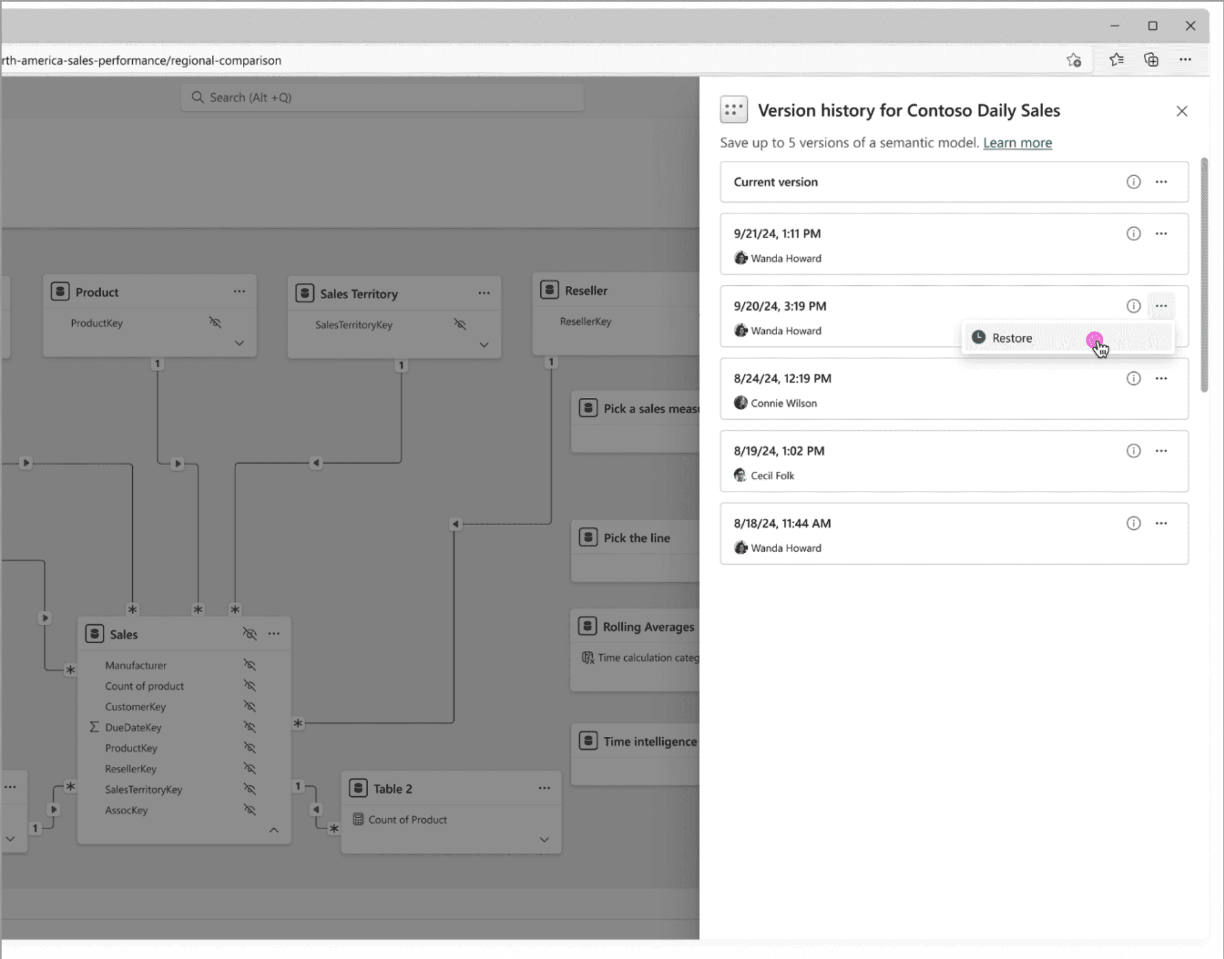
Semantic Model Version History: A long-awaited governance feature is now live. Power BI automatically snapshots up to five versions of each semantic model and shows them in an 'Office-like' history pane. BI teams can easily restore an earlier model if needed. This built-in versioning gives analysts confidence to iterate on complex models. If a change breaks something, you can quickly roll back.
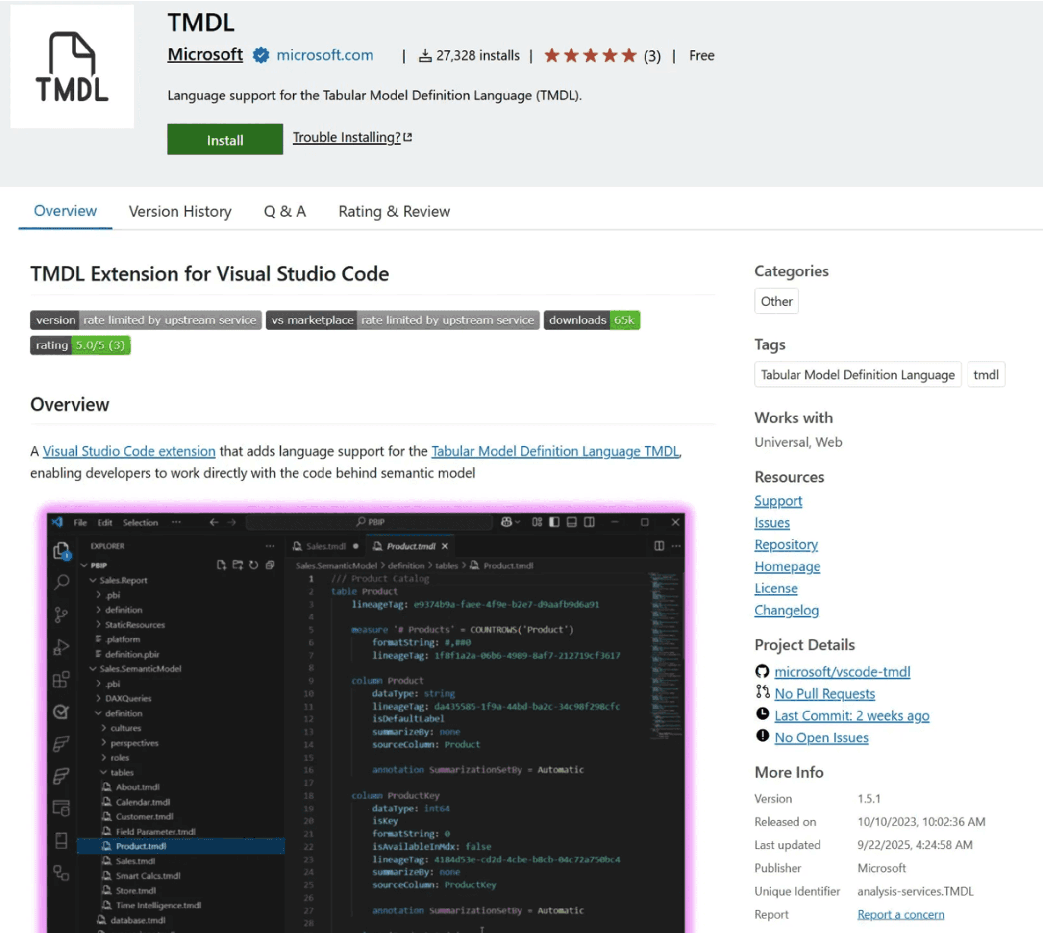
TMDL/VS Code Extension: The Visual Studio Code extension for Tabular Model Definition Language is now generally available. It brings rich IDE features (syntax highlighting, IntelliSense, refactoring) to Power BI model scripts. Development teams can manage models ‘as code’, apply bulk updates, and integrate semantic model projects with source control and AI tools dramatically improving developer productivity.
New Card Visual: The revamped Card visual is now available with several enhancements. It now supports ‘hero' images and a dynamic collage layout (one large image plus two numeric cards), letting dashboards showcase a photo or icon behind key metrics. The updated formatting pane offers consistent style controls. These improvements help teams build more engaging, on‑brand KPI cards and scorecards at scale.

Our Take
At Seven Red Lines, we actively use several of these capabilities in real client environments, across production dashboards and enterprise semantic models. Each feature has earned its place by addressing tangible needs, reducing friction, improving clarity, strengthening governance, or accelerating delivery.
From more expressive KPI storytelling to safer model iteration, to AI-assisted documentation, these enhancements have meaningfully changed how we work with Power BI. What follows is a practical perspective, shaped by day-to-day usage rather than release notes.
Card Visual
At Seven Red Lines, we use the new Power BI Card (KPI) Visual to enable clearer, more contextual performance reporting.
A KPI without context is just a number. Decision-makers rarely ask what the value is; they ask what it means and compared to what. The redesigned Card visual directly addresses this challenge.
Instead of showing an isolated figure, a single card can now bring together:
The primary KPI value
Reference points such as prior periods or targets
Percentage variance
A short explanatory note
Optional icons or images for quicker recognition
This allows the full KPI story to be communicated in one compact visual, reducing the need for multiple supporting charts and making dashboards easier to read at a glance.
Semantic model versioning
We also place strong emphasis on semantic model versioning.
In our delivery workflow, this capability is essential. Analytical models continuously evolve as requirements change, and insights deepen. Built-in version history gives us the confidence to move forward, knowing that we can safely experiment and quickly recover if needed.
It allows us to iterate with assurance, introduce improvements without hesitation, and maintain stability in shared, business-critical models.
Copilot for Measure Descriptions
Finally, we actively use Power BI Copilot for Measure Descriptions as a practical accelerator for documentation and overall efficiency.
Historically, writing measure descriptions was a manual and often neglected task. The result was inconsistent definitions and unnecessary friction for reporting authors and business users.
With Copilot, descriptions are automatically generated in clear, human-readable language. Rather than starting from a blank page, we review and refine Copilot’s suggestions to align with business terminology. This saves time, improves consistency, and significantly enhances model clarity.
The real shift is not just automation; it is focus. Analysts spend less time on repetitive tasks and more time ensuring accuracy, relevance, and insight.
As 2025 comes to a close, these generally available features clearly demonstrate Power BI’s direction: smarter analytics, stronger governance, and tools designed for real enterprise use. The platform’s pace of meaningful innovation continues to accelerate.


